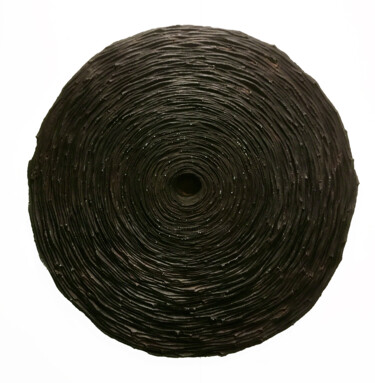
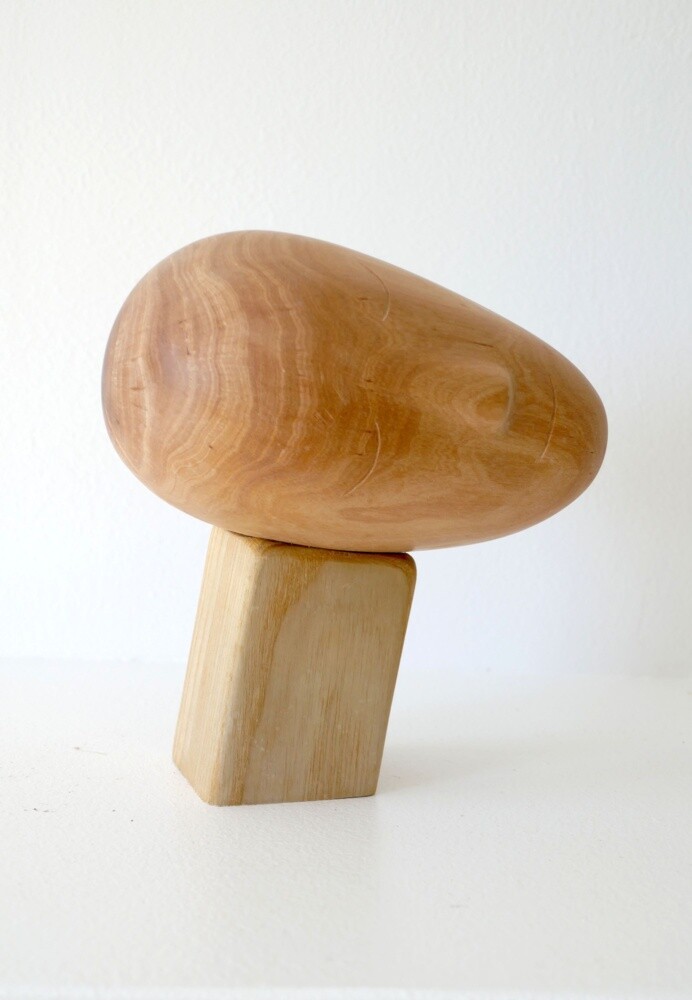
Egg #1 of sculptural series "Eggs" (2019) Sculpture by Tanya Klyat
The Presentation of Four Neutral Colors
Neutral colors such as white, gray, brown, and black have a long history in art, both in painting and sculpture. White, associated with purity, light, and perfection, has been a central hue since antiquity, especially in sculpture. Works created in white marble, for example, have not only influenced the aesthetic concept of beauty but have also indelibly shaped the course of Western art, from classical civilizations through the Renaissance and beyond.
The most iconic example of this is Michelangelo's "David", sculpted in Carrara marble, a supreme symbol of aesthetic perfection and heroism. The Tuscan artist skillfully utilized the quality of the material to accentuate the anatomical forms of the body, creating a striking contrast between the hardness of the stone and the apparent softness of the flesh. This duality brings to life a vision suspended between divine and human excellence.
In contemporary painting, however, white is often used to emphasize spaciousness or create contrasts, as seen, for instance, in minimalist art. In terms of interior design, incorporating white artworks into our spaces can undoubtedly help make an environment feel brighter and more orderly, characteristics that are ideal for both modern and more classic or minimalist settings.
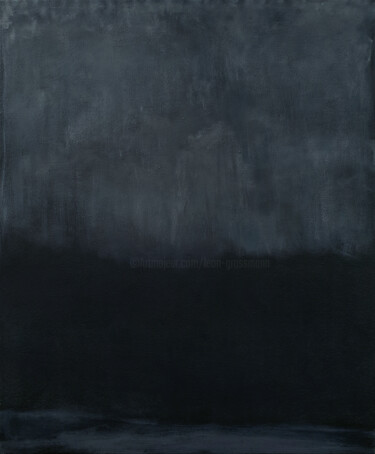
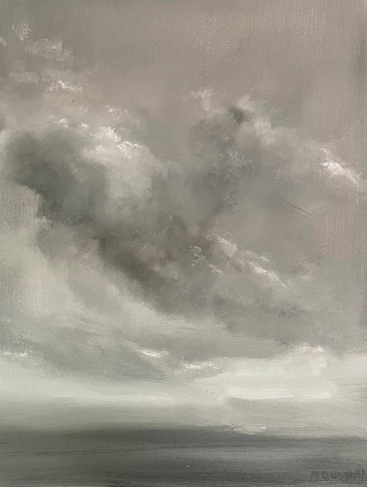
 "Grey January" (2024) Painting by Vladislav Zdor
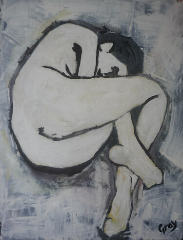
 "Abstract, white and brown" (2018) Painting by Alessio Mariotto
Regarding gray, this rather sophisticated neutral color is known for playing a key role in some of Gerhard Richter's masterpieces: paintings without a subject, which represent the ultimate exploration of painting as a medium. Indeed, these works, seemingly devoid of a defined motif, focus on the experimentation of the expressive medium to question the relationship between painting and photography. The goal is to understand how the former can continue to exist without relying on traditional colors or explicit figurative content.
Brown, a hue that evokes the earth and nature, has also played a central role in art for centuries. Taking the Renaissance period as an example, and immediately thinking of Rembrandt, one can see how this shade was masterfully used to evoke depth and emotional intensity, creating dramatic contrasts of light and shadow. Furthermore, this color was fundamental in depictions of everyday life and landscapes, as demonstrated by the works of Jean-François Millet, where brown expresses a deep connection to nature and rural life. Thus, it becomes evident that incorporating artworks in these tones into a home environment can enhance it, adding warmth and a sense of welcome, while creating an intimate atmosphere that promotes a feeling of rootedness and well-being.
 Farbauftrag Nr.10 (2024) Painting by Christoph Oberenzer
Finally, black, the color of mystery and depth, is often used to add drama and contrast in paintings, sculptures, and more. This is evident in the works of iconic figures in art history, such as Caravaggio, who skillfully employed this color to create a strong contrast between light and shadow, bringing an emotional and three-dimensional chiaroscuro to life. During the Romantic period, Francisco Goya also adopted black with unsettling power, giving his works a tragic and symbolic significance that had never been seen before. Remember "Saturn Devouring His Son?" Lastly, in the context of interior design, it is well known how the use of paintings and sculptures in these tones can transform a space: black not only captures attention but also contributes to creating a sense of depth and sophistication that is difficult to achieve with other colors.
To illustrate the use of these colors in contemporary art on Artmajeur, we can take as examples the works of Andrea Giorgi and Nataliia Sydorova for white, Olamilekan Okunade and Roger Quesnel for gray, Aleksandr Ilichev and Liquette-Gorbach for brown, and finally Alexandre Geoffroy and Roberto Barbuti for black.
 Omnia vincit amor (white) (2019) Sculpture by Andrea Giorgi
 White Gray (2023) Paintung by di Nataliia Sydorova
White: A Comparison between Painting and Sculpture
Andrea Giorgi and Nataliia Sydorova, two contemporary artists from Artmajeur, explore the power of white in their works, yet they do so in completely different ways, each enriching this neutral color with the uniqueness of their artistic language.
The Italian sculptor uses white in his plastic artwork "Omnia vincit amor", which, as the title suggests, was conceived to emphasize the concept of eternal love. The male figure, characterized by cracks and missing parts that evoke the wear of time, alludes to the vulnerability and resilience of love. White, therefore, is not just a color, but a metaphor for the purity and fragility of the human heart, where a small female figure is sculpted inside the protagonist's chest. This detail suggests that love is what silently fills and shapes the soul, yet remains eternal.
On the other hand, the Ukrainian artist Sydorova explores white through an abstract approach, likely “inherited” from the layered language of Gerhard Richter. Moreover, the artwork, with its rich texture of gray and white shades, was intended to create an almost monochromatic effect, enhancing and increasing the depth and movement of the vision. These very characteristics were designed to foster a sense of calm and introspection in the viewer, where the white emphasizes the surface of the canvas, creating an open and contemplative visual space.
It is evident, then, that while Giorgi uses this color to convey figurative emotions and represent human connections, Sydorova employs it in an abstract manner to enhance spatial perception and surface dynamism. In both cases, the artists give white a central and symbolic role, although with completely different stylistic outcomes.
 The bloom (2024) Painting by Olamilekan Okunade
 Windblown (2023) Painting by Roger Quesnel
The Symbolism of Gray
Artists Olamilekan Okunade and Roger Quesnel interpret gray through different styles and subjects, although both use it to evoke deep and complex reflections. The Nigerian painter uses this color in "The Bloom," a work conceived to allude to the process of cultural fusion, which manifests particularly in the institution of marriage. The use of gray represents the union between tradition and modernity, as well as the imposed Western values and the preservation of African cultural roots.
The typical Western wedding dress, along with the bouquet, symbolizes the widespread imposition of Western customs and ideals in African cultural contexts. The bride, dressed this way, becomes an emblem of the conflict and fusion between two worlds, suggesting that although marriage retains traditional elements, it is deeply influenced by globalization. In summary, gray can be seen as a chromatic bridge between African tradition and the symbols of marriage in white Western culture, expressing not only adaptation but also cultural resilience.
The Canadian painter, on the other hand, uses gray in a more "classical" way, utilizing its shades to achieve a more realistic, dramatic, and reflective atmospheric effect. In "Windblown," inspired by rain-laden clouds blown away by the wind, this color becomes a vehicle for expressing melancholic and meditative moods. Additionally, it is worth noting that the canvas is part of a monochromatic series, where gray plays a central role in creating an emotional connection between the scene and the viewer.
Thus, while in Olamilekan Okunade’s "The Bloom" gray becomes a symbol of cultural transition, suggesting a compromise due to the imposition of external norms, in Roger Quesnel’s work it focuses on freedom. These sensations reside in the same movement of the clouds swept away by the wind, representations of the autonomous and ever-changing nature of emotions and memories.
 BROWN PORTRAIT (2022) Painting by Aleksandr Ilichev
 Voyage (2015) Sculpture by Liquette-Gorbach
Brown: Between Psychology and Natural Balance
Aleksandr Ilichev and the artistic duo Liquette-Gorbach have interpreted brown in a figurative manner within their respective disciplines. Brown, a color traditionally associated with the earth, stability, and connection to nature, takes on unique meanings in their works. The painter Ilichev, known for his use of acrylic on canvas to explore inner life and human psychology, created "Brown Portrait," a nearly "divisionist" painting that captures the essence and emotions of the subject through layers of lines, colors, and textures.
In this context, the color is used in a vibrant and dynamic way: the girl’s face, covered in layers of brown and golden brushstrokes, suggests a complex inner life and deep emotionality, highlighted by a penetrating gaze designed to break the barriers between subject and viewer. While Ilichev uses the texture and shades of brown to impart drama and introspection to the portrait, bringing out the vulnerability and strength of the subject, the artistic duo Liquette-Gorbach has instead created a minimalist sculpture that evokes lightness and peace of mind. Their work "Voyage," made from exotic wood, reflects their fascination with simplicity and the natural expression of materials. Furthermore, the use of wood, along with the brown hue, provides an additional connection to the earth: the veins and polished surface of the material give rise to a sculptural form that seems almost organic.
It becomes clear, then, that unlike Ilichev’s approach, where brown serves as a vehicle for emotional expression, Liquette-Gorbach uses this color to emphasize simplicity and serenity, creating an object that invites contemplation and balance. Indeed, the sculpture, with its rounded and natural shape, conveys a sense of tranquility, with brown acting as a symbol of stability and continuity.
 Black Broken Mirror (2024) Painting by Alexandre Geoffroy
 Rhino (2015) Sculpture by Roberto Barbuti
Black Between Abstract and Figurative
Alexandre Geoffroy and Roberto Barbuti are two contemporary artists who explore the use of black in their works in profoundly different ways: the French painter focuses on light and depth through the use of glossy black and relief materials in his abstract works, while Roberto Barbuti uses the same color in painted terracotta to evoke the strength and vitality of animals inspired by Paleolithic cave paintings.
In detail, in "Black Broken Mirror," Alexandre Geoffroy uses black to explore light and shadows in a monochromatic series called "Pigments." This work is based on an innovative technique that combines spray and plaster on canvas, creating a relief surface composed of thousands of small squares. These squares reflect light and create a dynamic effect of shadows and reflections, giving depth and movement to the black, which, depending on the angle and light, can appear both matte and luminous. It becomes clear that for Geoffroy, this shade is a means to explore darkness and brilliance together, capturing the interaction between material and light.
In contrast, "Rhino" by Roberto Barbuti interprets black as a symbol of primal strength and animal vitality. The Italian artist, inspired by cave paintings, sculpts terracotta using the "colombino" technique, creating figures that retain the spiritual essence of the species they represent. Despite the use of stylized and non-realistic forms, it is important to note that his animal sculptures remain perfectly recognizable, exuding power and physical presence. Black, applied after firing with oil paints, serves to emphasize the musculature and mighty structure of the subject, giving it an aura of majesty.
It is evident that in "Black Broken Mirror," Geoffroy uses black in an abstract way, playing with light and shadow to create depth and three-dimensionality, with a visual interplay that transforms the color into a dynamic and shifting experience. In contrast, in "Rhino," Barbuti uses the same shade to highlight the physical and primal strength of the animal, making the color a symbol of tangible and concrete power. In both cases, black becomes essential for conveying intensity and depth, but with opposite stylistic approaches: one abstract and visually shifting, the other grounded in physicality and strength.
 Olimpia Gaia Martinelli
| ArtMajeur Magazine
Olimpia Gaia Martinelli
| ArtMajeur Magazine