The evolution of color in modern art marks a progressive journey toward emancipation from the obligation to faithfully depict visible reality. After Impressionism, where color was still inspired by natural elements, successive movements introduced a new tonal interpretation that went beyond mere reproduction of the external world, seeking deeper, more autonomous meanings. Fauvist Expressionism initiated this shift with a bold and distorted use of color: no longer descriptive, but emotional and symbolic, taken to the extreme in the works of artists like Matisse. Here, color becomes a vehicle of inner expression, transforming representation into a visual experience.
With the advent of abstract monochromes, color was stripped of any reference to form and representation. Artists like Yves Klein and Kazimir Malevich sought pure expression, where color became the sole protagonist in a visual field that claimed the full expressive power of painting itself. The absence of the real, of a recognizable subject, allowed perception to focus solely on chromatic quality, bringing color to its ultimate communicative essence.
In parallel, Pop Art transformed pigments into an iconic visual language: in the works of Andy Warhol, Roy Lichtenstein, and other artists of the movement, bright and saturated colors were used to reflect consumerism and mass culture, bringing visual expression closer to the language of advertising and challenging the boundary between art and popular culture. Here, color does not merely represent but incorporates and elevates the symbols of everyday life, creating an intense interaction between visual beauty and mainstream messages.
The chromatic brilliance of this movement, along with its exaggerated saturation, transforms familiar products and faces into universal emblems, detaching them from their ordinary meaning. In this process, colors become an essential element of celebration: they grant images a magnetic, almost timeless presence, as if what is ephemeral and destined for rapid consumption could endure and become "divine."
Finally, digital art represents the new frontier in chromatic exploration, offering unprecedented possibilities for experimentation through technology. In this domain, color can be manipulated and combined with a freedom never before known, becoming a tool to explore new dimensions of meaning and perception.
The following analysis explores these approaches to color, illustrating them with concrete examples of artworks by Artmajeur artists, aiming to reveal how chromatic choices can enrich and transform the representation of reality, adding depth and new meanings.
 Morning. A glass of water (2024) Painting by Mykola Kozlovskyi
 Quel ennui (2024) Painting by G. Carta
Fauvism and the Chromatic Revolution: From Reality to Emotion
These two works exemplify a typically Fauvist use of color, where vibrant pigments, liberated from naturalistic representation, convey a personal expression that goes beyond mere depiction. In Morning. A Glass of Water by Mykola Kozlovskyi, colors are not used to faithfully reflect the landscape view from the window but rather to communicate an intimate and contemplative atmosphere. The saturated, unnatural hues of the exterior scene, with intense blues and greens, deliberately reinterpret reality to evoke a serene, timeless mood. This approach, which departs from naturalistic rendering, emphasizes the emotion of the moment, transforming the landscape element into an almost meditative experience.
In Quel ennui by G. Carta, color is not only a tool for representation but also a vehicle for evoking a complex spectrum of emotions. The vivid and contrasting tones, such as the bright green background and the pink and orange shades of the face, create a chromatic tension that captures the viewer's attention, inviting them to explore the subject's inner world. The combination of these colors, distant from realistic tones, suggests a subtle, almost existential unease that resonates with the title of the work, Quel ennui ("What boredom"). The cool, detached green of the background contrasts with the warm, saturated hues of the face, creating a disorienting effect and reinforcing a sense of isolation. This chromatic "opposition" amplifies the subject's expression, appearing immersed in a kind of melancholy, in a moment of deep introspection. The intense colors do not merely define the contours and shapes of the face but seem to pulse with restrained inner life, with emotions unspoken, as if the subject were suspended in an indefinite thought or a passive state that only the viewer's gaze can penetrate.
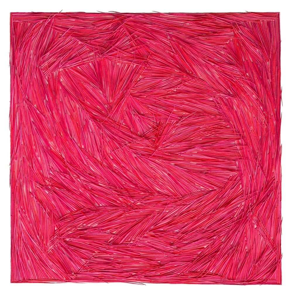 Pink (Colours of Nature) (2024) Painting by Gleb Skubachevsky
 Suture (2022) Collage and Painting by Pauline Della Pera
Monochromes: When Color Becomes Absolute
In the realm of monochromes, Pink (Colours of Nature) by Gleb Skubachevsky and Suture by Pauline Della Pera offer a profound reflection on the language of color and material, entirely detached from realistic representation. These works do not simply explore the shades of a single color but emphasize its expressive potential, focusing on rich material layering and tactile physicality that transform the painted surface into a field of intense perceptions.
In Pink (Colours of Nature), Gleb Skubachevsky employs his distinctive technique of paper on canvas, creating a visual and tactile effect in which the color pink unfolds as a vibrant, lively field. Created in acrylic, this monochrome belongs to the "Colours of Nature" series, where the artist selects and combines natural colors, presenting them as if they are organically emerging from the canvas surface. The repetition of lines and the arrangement of textures evoke an organic growth, suggesting an abstraction that, while monochromatic, is enriched by natural nuances and a sense of vitality that seems to expand beyond the canvas boundaries. Here, pink is not merely a color but becomes an element that, through refined manipulation of the material, evokes the complexity of the ecosystem itself.
On the other hand, Suture by Pauline Della Pera, created in 2022, is an exploration of black through a mixed-media process involving collage, ink, acrylic, spray paint, and embroidery on canvas. Black here becomes a field of tension and silence, a surface that, thanks to the materiality of the technique, oscillates between painting and sculpture. The “sutures” visible on the surface, made with embroidery threads, add a dimension of fragility and manual intervention, like marks of a metaphorical wound, a tangible trace of the artistic gesture. Black, stripped of any descriptive function, acquires an almost spiritual quality, a depth that recalls the explorations of artists like Kazimir Malevich, where color transforms into a vehicle for absolute contemplation.
 EGG WOMAN POPART (2024) Painting by Claudia Sauter (Poptonicart)
 Who's that? (2024) Painting by Alex Bond
Pop Art: Color as an Icon of Mass Culture
In the two works Egg Woman Popart by Claudia Sauter and Who’s Who? by Alex Bond, color emerges as a fundamental element, transforming the depiction of reality into something vibrant and iconic, fully in line with the Pop Art style. This movement is known for its use of intense, contrasting hues, reminiscent of printing and advertising tones, making images highly memorable and indelibly linked to mass culture.
In Egg Woman Popart, the use of bright turquoise as a background creates a strong visual impact and accentuates the surrealism of the image, where a white egg dominates the woman’s face, evoking the manipulated imagery typical of pop language. The contrast between vivid colors and the distorted human figure evokes a sense of whimsy, making the work an ironic and bold interpretation of contemporary visual culture. This use of color not only captures attention but also deeply embeds itself in the viewer's memory, much like an effective advertising campaign would.
In Who’s Who?, Bond reinterprets the icon of Marilyn Monroe by overlaying her face with that of another person, creating an image that invites the viewer to reflect on concepts of myth and identity. The saturated, unnatural colors, such as yellow hair and pink skin, recall Warhol’s technique and his approach to decontextualizing celebrities, elevating them to objects of cultural consumerism. Here, color serves not merely to represent but to emphasize and distort, challenging visual conventions and transforming a familiar face into a symbol that prompts reflection on fame and the superficiality of popular imagery.
 Shelf Life - (2024) Digital art by Tim Cutler
 La Mémoire des Échafaudages (2024) Digital art by Sid
Digital Art: The New Frontier of Color
The digital works Shelf Life by Tim Cutler and La Mémoire des Échafaudages by Sid exemplify the innovative use of color in digital art, emphasizing both visual composition and the symbolic significance of the selected hues.
In Shelf Life, the use of saturated, bright colors spanning a rainbow spectrum creates a hypnotic and artificial effect, almost underscoring the constructed and coded nature of the work. This luminous cube, containing silhouettes of human figures, evokes a sense of rigid structure and control. The distinctive, contrasting colors in each section of the cube emphasize the isolation of the subjects, as if they were fragments of a compartmentalized and monitored society. The reflected light and vivid colors produce an immediate visual impact, recalling the aesthetics of advertising signs and commercial displays, while also suggesting an exploration of standardization and conformity of the individual in the digital age.
La Mémoire des Échafaudages by Sid stands out for its intense and brilliant color representation, despite remaining in dark, deep tones. The colors are applied to evoke the strength of wood and building materials, creating a striking contrast with the apparent fragility of the asymmetrical structure, which represents a "stylized" human figure. This "digitalized cubism" emerges from a dark background, emphasizing the dramatic composition and highlighting the figure, as if it were surrounded by a vibrant glow accentuating its contours.
The combination of dark and vibrant hues gives the work a sense of tension and instability, as if the structure were on the verge of collapse, evoking a profound sense of impermanence. The delicacy of pixels and the ephemeral nature of digital data further accentuate the precariousness of memory and visual perception. Sid thus manages to represent transience, imbuing the work with a quality that, although digital, appears surprisingly human and tangible, suggesting the inherent vulnerability of the image itself.
 Olimpia Gaia Martinelli