You meet a child holding a lollipop and ask,
"Do you know what abstract art is?"
The child looks at you curiously and shakes their head. So you explain:
"Abstract art is like drawing what you feel or imagine, without having to show something real. There are no recognizable houses or people, but shapes and colors that tell emotions or ideas. It's a bit like saying, 'I’m not showing you a tree, but what the idea of a tree makes me feel.'"
The child’s eyes light up, and they reply,
"Oh, so it’s like a drawing that looks like a dream—not real, but it makes you feel something?"
"Exactly!"
Then, curious, the child asks,
"And where has this been really important?"
You smile and answer,
"In the Western world, especially in places like Germany, America, the Netherlands, and France."
That’s the purpose of this article: to talk about abstract art in an accessible way, using simple and universal language that can speak to everyone, as if addressing a child. This approach isn’t about oversimplifying but rather democratizing art, bringing it closer to anyone who wants to understand it, regardless of age or knowledge.
Abstract art has the power to break the barriers of language and traditional representation, and our goal is to do the same: to tell the story of the contributions from Germany, the United States, the Netherlands, and France through a clear and engaging narrative, capable of reaching both the curious and the passionate.
This will be a journey through colors, shapes, and ideas, where each country becomes a special stop. A path where, with a childlike and inclusive tone, we’ll try to uncover the emotions and magic hidden behind abstraction. Are you ready to explore this extraordinary world? Let’s begin!
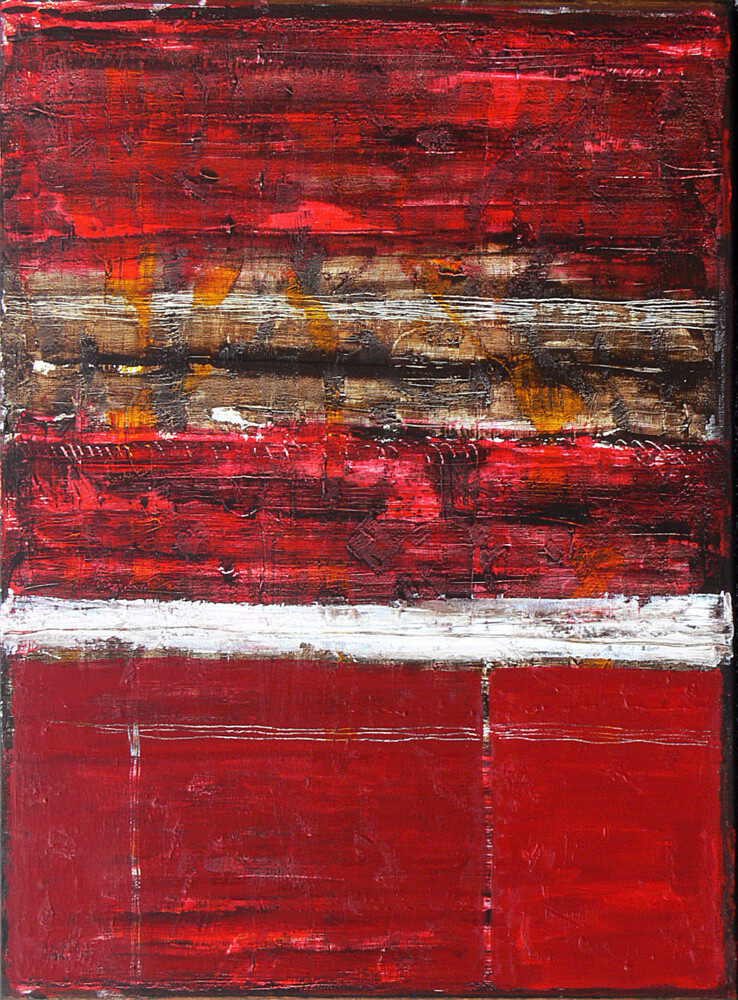
 Boiling midnight (2023) Painting by Ronald Hunter
Germany
In Germany, some brilliant artists changed the art world, starting with a simple idea: painting what you feel, not just what you see.
Once upon a time, in 1905, there was a group of artists in Dresden called Die Brücke (The Bridge). They wanted to "build a bridge" between the old way of making art and something new. They used vibrant and sometimes strange colors, bold lines, and painted scenes of cities, circuses, and people who seemed lonely. Through their paintings, they wanted to show what it means to be human, with all the beautiful and difficult emotions.
Then, in 1911, another group of artists in Munich, called Der Blaue Reiter (The Blue Rider), took things a step further. One of them, Wassily Kandinsky, thought: Why paint only what we see? Let’s paint what we feel in our hearts and minds! He began creating paintings full of colors and shapes that seemed to dance, expressing emotions and ideas instead of real objects. This was the birth of abstract art!
After World War I, in 1919, a special school called Bauhaus was founded. Here, art became something useful too. People learned to combine beauty with the practicality of everyday objects, like furniture or buildings. The idea was that everything, even a chair or a cup, could be a work of art.
Great masters like Kandinsky, Paul Klee, and Josef Albers taught at the Bauhaus. Paul Klee, for example, said that colors were like music: they could touch our hearts just like a beautiful melody. At Bauhaus, artists weren’t afraid to experiment. They drew, built, and invented new things that still inspire many people today.
During World War I, many German artists fought and saw up close how terrible war was. This changed the way they painted. Some, like Otto Dix and George Grosz, created very realistic and harsh paintings that showed the suffering of people and the horrors of war. It was their way of telling the world how unfair it all was. Other masters chose a different path to express what they felt. They didn’t want to show real images but preferred to use shapes, colors, and lines to talk about their emotions and the chaos they felt inside.
After World War II, a German artist named Gerhard Richter began experimenting with new ways of creating art. He used photographs, colors, and layers of paint to create paintings that looked blurred, as if you were looking at a distant memory. In his abstract works, he mixed colors and shapes to create pieces that seemed chaotic yet natural, like a landscape seen in a dream.
German abstract art has taught us that there isn’t just one way to see the world. Through colors, shapes, and ideas, these artists created a universal language that anyone can understand without using words. It’s an art form that speaks to the heart, inviting us to think and feel.
And so, thanks to them, we can look at an abstract painting and ask ourselves: What does it make me feel?
 Brown Taupe Abstract Painting, Cozy Conversations (2024) Painting by Leon Grossmann
Contemporary Example
This painting by Leon Grossmann is called "Brown Taupe Abstract Painting, Cozy Conversations." It’s not filled with bright colors but uses dark tones like brown and gray, with a white band at the bottom. Looking at it, the painting seems to tell a story of calmness and a bit of mystery. The blended shades transition from darkness to light, as if the bright and dark parts were silently conversing with each other. The artwork invites you to pause and think. It makes you wonder: "What’s happening between the white and the black?"
Leon Grossmann didn’t aim to draw something recognizable but wanted to make us feel emotions, much like many German abstract artists. His colors don’t show us something; they make us feel—perhaps calmness, or maybe a quiet conversation. The hues of the painting seem to overlap like layers of thoughts or memories, each with a small story to tell. Words aren’t needed to understand it because it’s a language that speaks directly to the heart. Even though the painting appears still, there’s a subtle sense of movement in the colors, like a flow of thoughts coming and going.
Looking at this work, you can pause and ask yourself: "How does this make me feel? Does it remind me of something?" This painting doesn’t tell a specific story but leaves room for your imagination, inviting you to create your own story guided by the emotions it conveys.
America
In the 1940s and 1950s, in New York, a group of artists began experimenting with a new way of painting. They no longer wanted to paint recognizable things like people, trees, or houses, but instead used colors, shapes, and gestures to express deep emotions and universal ideas. This movement was called Abstract Expressionism, and it became a symbol of American creative freedom.
Jackson Pollock was one of these artists. Instead of using a traditional brush, he dripped and splashed paint onto huge canvases laid on the floor. His paintings seemed full of energy, as if the paint itself were telling stories of chaos and life. Another important artist was Mark Rothko, who painted large rectangles. Rothko believed that colors could make us feel emotions like calmness or mystery.
Willem de Kooning, on the other hand, combined human figures and abstraction. In his paintings, the forms seemed to move, as if each brushstroke told something alive and evolving. All these artists had one thing in common: they wanted their art to explore emotions and thoughts without needing to imitate reality.
In those years, art in the United States was still finding its place, far from European influence. But with Abstract Expressionism, New York became the new center of modern art. American artists, with their enormous canvases and unique styles, showed the world an art full of energy and freedom. This success also included great female artists like Lee Krasner and Helen Frankenthaler, who made significant contributions to the movement.
In the 1960s, a new group of artists decided to move away from Abstract Expressionism to create something different. This led to the birth of Minimalism, an art movement defined by simple shapes and industrial materials. Donald Judd, for example, created geometric sculptures that looked like they came out of a factory, while Frank Stella painted works with lines and shapes that emphasized the simplicity and power of color and space.
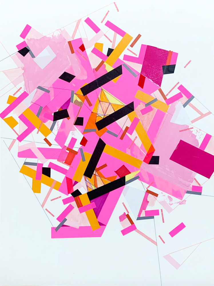 Memory of Serdull 1 (2022) Painting by Philippe Halaburda
Contemporary Example
The artwork Memory of Serdull 1 by Philippe Halaburda is like an explosion of colors and shapes blending together. Pink is the dominant color, shining brightly among yellow, black, and hints of red and orange. There are many rectangles and lines intertwined in an apparently chaotic way, but in reality, everything carries meaning. Looking at it, it feels like the painting represents the thoughts and emotions moving through our minds.
Philippe Halaburda created this piece to show how the brain copes with changes related to memory. Pink represents thinking and learning, yellow symbolizes a sense of being lost, while black conveys confusion. Each color has its own meaning, and together they create a dialogue, much like the Abstract Expressionist artists did in America.
Like Jackson Pollock, who painted with energy and freedom, Halaburda uses geometric shapes in a spontaneous and dynamic way. The lines and colors seem to float, creating a balance between chaos and order. It’s as if the painting is telling a story, but without using words.
France
More than 100 years ago in France, some artists began painting in a completely new way. They wanted to create art that didn’t depict things from the real world, like houses or people, but instead used only colors and shapes to evoke emotions. Sonia and Robert Delaunay were among the first to create this type of art. For example, Sonia designed a blanket full of colors and abstract forms, while Robert painted circles and lines that seemed to dance. This new style was called Orphism, named after Orpheus, a character from Greek mythology famous for his magical music.
The artists of Orphism used bright colors and lines that gave a sense of movement. They believed color was like music: it could make us feel happy, sad, or energized without needing detailed drawings. Sonia Delaunay even brought this art into fashion, designing colorful clothes and home décor. Orphism lasted only a few years, as the outbreak of World War I in 1914 forced the artists to pause their work.
After World War II, France was filled with sadness and fear from everything that had happened. Artists wanted to find a way to express these feelings and decided to create art without rules. This style was called Art Informel: instead of precise figures, it used free brushstrokes, splashes of color, and "unusual" materials to create works that spoke of pain, chaos, and also hope.
Many French artists embraced this new approach to art. For instance, Georges Mathieu made large, energetic gestures with his brush to create vibrant paintings, while others used different materials, such as sand or fabric, to give their works a rough and realistic appearance. Each masterpiece was unique and showed how the artists saw the world after the war.
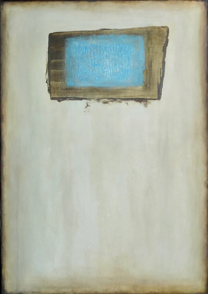 145d (2024) Painting by Farid Bellal
Contemporary Example
In this painting, we see a bright blue rectangle near the top center, surrounded by a light background in beige and brown. The background feels calm and quiet, while the sky-like blue stands out as if it were suspended in a vast empty space.
The colors speak to us: the blue might make us feel calm or serene, while the beige and brown remind us of something simple and natural. The artist doesn’t show us objects or people but instead invites us to feel what the colors want to communicate.
Farid Bellal uses simple shapes, like the rectangle, to express deep ideas. He doesn’t tell us what to see but leaves us free to imagine and feel personal emotions. The blue in the center feels almost alive, like a small ocean enclosed within the rectangle. Looking at it, we feel drawn closer, letting our imagination dive in to discover what might be inside—fish, boats, or perhaps something completely different.
The Netherlands
A long time ago, during World War I, the world was very chaotic and unhappy. Artists in the Netherlands wanted to do something to make life better and more harmonious. They believed that art could bring a sense of order and hope.
In 1917, two great artists, Theo van Doesburg and Piet Mondrian, created a group called De Stijl, which means "The Style." They thought that only the simplest elements were needed to represent a more beautiful world: geometric shapes like squares and rectangles, straight lines, and basic colors like red, blue, yellow, white, and black. This trend was like a special language designed to showcase order and harmony.
Mondrian also believed that his artworks could represent the forces of the world. He used vertical and horizontal lines to talk about things like movement and stillness or masculinity and femininity. His masterpieces looked very simple, but in reality, they were carefully planned to be balanced and harmonious, as well as easy for everyone to understand.
Van Doesburg, on the other hand, thought that paintings needed a bit more movement. He used diagonal lines and tilted shapes, making his works appear more dynamic and lively. This difference in approach caused disagreements between him and Mondrian, and eventually, they stopped working together.
The artists of De Stijl didn’t limit their style to paintings. They wanted to bring it everywhere: into homes, furniture, books, and even buildings! For example, an architect named Gerrit Rietveld designed a famous chair, the Red and Blue Chair, and a special house called the Schröder House. This way, people could live in a space full of harmony.
By the late 1920s, the artists in the group realized that it wasn’t easy to bring their vision into the real world. They began to have different ideas, and De Stijl eventually dissolved. However, their work was never forgotten.
 Red landscape 2. (2015) Painting by Leo Bos
Contemporary Example
Red Landscape 2 is a painting that represents a landscape, but in a very different way. There are no trees or houses, only colors and shapes that spark our imagination. The artist, Leo Bos, used red as the main character, with a white line across the center and some brown around it. The brushstrokes are thick and rough, giving the painting a sense of movement, almost as if it were alive.
The scarlet red is a strong and intense color that can evoke emotions like strength or passion. The white line, on the other hand, seems to bring calm and tranquility, like a pause in the midst of the red. The horizontal bands of color make us think of land or a horizon, giving a feeling of stability. Even though the painting is abstract, everything feels like it’s in the right place. Those thick and rough brushstrokes add an extra layer of interest, as if the work contains an energy we can almost feel.
 Olimpia Gaia Martinelli
| ArtMajeur Magazine
Olimpia Gaia Martinelli
| ArtMajeur Magazine